Welcome to another edition of the CTMH Stamp of the Month Blog Hop! No fooling, it's April already! (If you're already hopping, thanks for stopping in from Nicole G.'s blog. You'll head next to Jen R.'s blog.) The April Stamp of the Month, Blessed, is a lovely set so perfect for upcoming weddings. I know that I'll be using the sentiment, "We are so blessed," on lots and lots of projects.
Obviously I didn't go the wedding route with my card. I wanted something spring-y and cheery, although this card did not end up anything like what I had envisioned when I started out! The sentiment piece was larger than I thought it would be, but I finally pulled something together that I like. I hope that you like it too!
I began by stamping the vine/flower stamp three times in Pear across the front of the Pear card, varying its placement from top to bottom. Then, I used the smaller flower stamp to fill in at the top and bottom of the card. Next came the focal image. I stamped this beautiful saying in Hollyhock, then stamped the same stamps from the card base on the edges of this piece. Finally, I used the "base" floral stamps to fill in the flowers in Goldrush and Blush. Easy peasy with no coloring necessary! I'm also linking this card up to today's 365 Cards challenge: Day 31- A Piece of Poetry. I love this sentiment dearly!
To finish off the card, I used two different patterns from the Sophia paper pack for the center strip and the bottom right square. They are matted on Goldrush and Hollyhock cardstock, respectively. I love using knots versus bows on so many projects because (a) they are easier and (b) they mail better. A little embroidery floss and cute button from our pink button collection finishes the card nicely.
To continue on the blog hop, head to Jen's blog now to see her amazing creation. Thanks for hopping by!
▼
Thursday, March 31, 2011
Wednesday, March 30, 2011
Share your Story: Studio J
Please watch my Fabulously Artsy friend Tresa Black's video! Not only is it wonderful, but you'll help her win an amazing CTMH prize. Thanks for watching! Please share with YOUR friends too.
Tuesday, March 29, 2011
Sophia "It's a Wrap" Notecard
Aren't the Sophia papers and the Sophia Workshop on the Go stamp set adorable? They are so perfect for spring! This notecard was fun (and easy) to make. (The complete instructions can be found in the Wishes how-to guide.) Begin with a 4.25"x5.5" piece of White Daisy cardstock. Stamp the edges with the vines, leaves, and flowers, leaving room to write your note in the center. (My large flowers are Hollyhock with Goldrush centers, the small flowers are Blush, and the greenery is Pear.)
Wrap a piece of 9.5"x4"* B&T paper around your notecard so that the top overlaps a bit. Fold smartly to keep it in place. Then, decorate a center panel to glue on the wrap. (Since the top of my center decorative panel was hidden, I tore off a bit of the wrap. I really like how it turned out!)
(*The original instructions called for this piece to measure 9.5"x4.25", but I pared it down to get three out of a 12"x12" sheet instead of only two. Who's going to miss that quarter inch? Not me!)
Enjoy your day today! I know that I sure am.
Sunday, March 27, 2011
Sensational Seasons Cards: Babies or Easter?
Aren't these bunnies sweet? At 4.75"x3", I think this card would make a great baby gift enclosure card, either with Peter Rabbit's twin or Mama Bunny. These cards all use the "Center Accent" sketch pattern from Originals and were all colored with watercolor pencils.
You may be asking, "What are watercolor pencils and how do they compare with regular pencils?" You can use them just like you would regular colored pencils, or you can add water to blend them. I love how they look blended with water! (I used a waterbrush with mine, but a blending pen or thin paintbrush would work too.) I think that even though it takes two steps (color w/pencil and then w/water), because you don't have to color really carefully that it kind of negates the time of two steps. Give them a try and you'll see what I mean!
Friday, March 25, 2011
Mojo Monday Meets Moxie Fab Tuesday Trigger: Citrus Celebration
This deliciously inspiring photo is this week's Moxie Fab "Citrus Celebration" Tuesday Trigger. As soon as I saw it, I knew that I would make my own cupcake liner using the Pear polka dot paper from the Close To My Heart Sophia collection. I've seen some great cupcakes made with crimped paper and half circles, so off I went.
These colors pushed me out of my comfort zone a bit, which is always challenging but fun. I think the yellow makes a great lemon cupcake (of the no-calorie variety). I think it will be the perfect card for a sweet young lady we know who has a birthday in June. She is definitely a citrus-y, neon kind of gal!
I couldn't resist pairing it with this week's Mojo Monday sketch #183. I was able to use up lots of scraps from a variety of CTMH paper packs (4 total). I couldn't believe how well they worked together. Can I let you in on a little secret? The yellow paper is the back side of the patriotic, primary Fanfare paper pack! Of course I love the dashes of pink that the Sophia floral paper provides.
I also realized that this fits the current Charisma Cardz challenge: Birthday for a Teen. (Our sweet friend who will receive this card will be turning 13!)
Supplies from Close To My Heart: Tag the Occasion stamp set; Sophia, Olivia, Hooligans, and Fanfare paper packs; Pear and Sunny Yellow inks; Pear and Sunset markers; 2" scalloped paper punch; 1-1/4" circle punch; Pear Mini-Medley Accents
Other: 1-1/2" scallop punch; thin yellow Offray ribbon; paper crimper
Thursday, March 24, 2011
Hope for Japan, CTMH-Style!
As the devastating news has unfolded around us, many of us have wondered how we can help Japan. My daughter's 4-H club and school are organizing a "U 4 J" campaign (our county for Japan). Close To My Heart, being the kind and caring company that they are, has designed a gorgeous stamp set available through April 30 to support the American Red Cross's efforts in Japan.
The CTMH A-size stamp sets normally retail for $7.95, but for this campaign, the "Hope for Japan" stamp set can be yours for only $5. 100% of the proceeds will benefit the Red Cross efforts in Japan. I am going to order mine this weekend, so if you'd like to order one, or several, just let me know. (Wouldn't this make a great gift?) The recommended acrylic blocks for this set are 1" × 1" (Y1000), 1" × 1 1/2" (Y1001), and 3" × 3" (Y1006). (Remember that there is also a free block special in March!)
Together we can do great things!
Monday, March 21, 2011
Bohemian Baby Card
Two different challenge blogs totally inspired me to create this "welcome baby" card. Over at Heart 2 Heart, the "Oh Baby" challenge is to create something for baby. At 365 Cards, today's (Day 21) challenge is the "A, B, Cs of Crafting" challenge: A is for alphabet, B is for blue (which I didn't use but could have), and C is for circle. You only had to use one of the three, but I (obviously) used two.
I began with a Blush card base, and I stamped "welcome" from the Around the Block stamp set in the top left corner. On a 2"x5.5" strip of White Daisy cardstock, I stamped "baby" in Hollyhock using the Bohemian Alphabet stamp set. The pleats use paper from the Sophia paper pack. As I assembled the card, I thought it needed a little something, so I "faux stitched" the Hollyhock stripes on the sentiment piece. (I drew a freehand line with the marker then went back and pierced it at regular intervals to mimic stitching.)
Finally, I created the flower using two flowers from the Spring Blossoms Just Blooms. The pleated scalloped flower was made with another pattern of the Sophia paper pack. (Scroll down to find a tutorial if you're interested.) A few pearls on the letters and a pearl in the center of the flower finished off the card. I think it turned out really pretty in pink! Hope you like it too.
Sunday, March 20, 2011
Thinking of You Card
Here's a quick and easy "thinking of you" card that I made today using the Sophia paper pack and Workshop on the Go stamp set. I began by stamping the bird after inking up the body in Blush, rolling it in Hollyhock, wiping off the beak, and inking up the legs and beak in Goldrush. I added the sentiment from the Fringed Flourishes stamp set (in Pear). Finally, an Opaque Pearl made a sweet little eye.
On the Blush cardstock base, I stamped the flourishes in Pear, the flower in Blush, and the little circle (berry? bud?) in Goldrush. After layering a strip down the side and layering the focal image, it quickly became a card.
Tomorrow, I'll decorate the envelopes and get a few of these in the mail to some friends who I've been thinking and praying about. Hope that you have a great week, and know that I am thinking of you, my blog readers, too!
Friday, March 18, 2011
Stacked Presents Cards
This card was a total hit at my recent card class! I love how they turned out, and they are so, so easy to make. (The very talented Vicki Wizniuk totally inspired these cards.)
The birthday card uses the Wings paper pack and a sentiment from the Party Pennants stamp set. (The Vineyard Berry ribbon is retired, but everything else is current.) The presents measure 1"x2.5", 1"x2", and 1"x1.5".
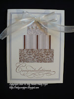
The second card uses the new Bliss paper pack to make a simply elegant wedding or bridal shower card. (The sentiment, stamped in Chocolate, is retired.) Isn't it reminiscent of a wedding cake? I added Opaque Pearls to the top layer to continue the bridal theme.
Hope you have a crafty weekend!
Thursday, March 17, 2011
Happy St. Patrick's Day!
Wishing you a bit o' luck today!
How do you make a St. Pat's Day card when you don't have any stamps for the occasion? And there isn't enough time to buy some? (Gasp!) Turn a heart stamp into a shamrock, of course! Participants at my recent card class and I used a little heart stamp from the A Game stamp set, stamped it four times in a cluster, drew a marker "stem," and called it Irish.
The background technique takes advantage of this month's CTMH special: free blocks. Ink up your block (w/o any stamps) and then press onto your cardstock. Instant block o' color! (The border is a unique feature of CTMH blocks.)
We finished off this simple card by stamping the border from the Wings Workshop on the Go stamp set onto the Pear patterned paper (in Pear ink). I think it looks quite Celtic on this card.
Well, enough of my blarney! Have yourself a great day, and don't forget the wearing o' the green! Happy St. Patrick's Day!
Tuesday, March 15, 2011
CTMH Product Spotlight Blog Hop: Scrapbooking Techniques
Welcome to another CTMH blog hop! This hop is a short one featuring some amazing scrapbook techniques, so hop along! (If you're already hopping then you should have arrived from Tamytha's blog. Otherwise, you can start right here, hop to Jill's blog next, and keep hopping right around this blog hop.)
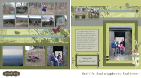
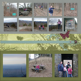
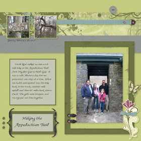
As much as I love classic (paper, ink, and adhesive) scrapbooking, my life has been a little hectic lately (plus I'm trying to move my craft room, one item at a time) and my craft time has been severely limited. One thing I have been able to do is spend time with my husband watching TV and scrapbooking the Studio J way, on my laptop with my digital photos! There is absolutely no mess to clean up- just hit save and close the laptop! Wow, that's not too hard! If you haven't given Studio J a try yet, visit your CTMH consultant's website (or MINE) to get started for free. These pictures were taken on a recent (grueling) hike where we hiked over 8 miles on the Appalachian Trail. I love that I was able to scrapbook them almost immediately after I took the photos! (Not to mention, I was too sore to do much of anything else.) While I didn't originally think of the Wings collection, I love how these colors work with my photos! Here are a few of the things I was able to do in Studio J:
*Sponging/distressing: You can "sponge" color onto pieces of Studio J "paper." Maybe you can tell that I sponged Grey Wool onto the Sweet Leaf background of the right page. Then, I only distressed the edges of the photo mat so that it would "pop" a bit more. Studio J is very user-friendly, and I'm finding it great fun to use! Give it a try. If you don't like what you do, just click "undo." I love that feature!!! Feel free to email me directly (email on sidebar) if you have questions, or leave them in the comments section. *Text directly on a photo: Create a text box from the pull-down text tool window, place it directly over a photo you've already inserted, and type away!
*Using My Stickease to cover up parts of the patterned paper that you don't like: Do you see the green butterfly in the middle left of the left page? It is covering a butterfly on the patterned paper background that was upside down. You can rotate the paper orientation in Studio J and I loved how the patterned paper looked except for the upside down butterfly. I slapped a My Stickease butterfly over the renegade critter and then loved how it looked. (You can also rotate the layout pages!)
*Layering My Stickease: You can layer the My Stickease on top of your photos, journaling, and each other!
Thanks for stopping by! Head over to Jill's blog for some more scrapbook inspiration!
{Layout 2011 #17}
Sunday, March 13, 2011
Diamond Fold Card & Pleated Scallop Flower Tutorials
Here's a new-to-me card fold: the diamond fold card! I have to thank fellow CTMH consultant Brenda F. for a great tutorial (on her blog HERE). I made mine with the Sweetheart papers and taught my card class participants today how to make their own. It really is easier than it looks, so I encourage you to go check out Brenda's great tutorial!
Angela Tutton also has a great tutorial on her blog that shows how to created a pleated flower using the 2" scallop punch! Click HERE to learn how. I made mine slightly differently than hers by using one whole scallop- minus one segment (like she did)- plus a slightly larger second scallop (one half plus a segment, all one piece) for the other so that I could overlap the pieces. This is much easier to show than to explain! LOL Hopefully that's enough info to jog my students' (and my) memories.
Friday, March 11, 2011
Studio J Tips (and Another Layout Share)
No, you're not seeing double (or even triple)! If you've followed my blog for a while, you may remember that I made this layout of my sister's family for my Mom and Dad for Christmas. I meant to order a copy for my sister but inadvertently left it out of my cart! (She got an IOU as part of her present.)
Before I reordered it for her, I decided to personalize it for my family album, because that's what the album is all about. I just changed the original text to read "Aunt Amy, Uncle Jason, Alex, & Will."
Then, I decided to customize the layout for my sister. They didn't need all their names on it, so I used the My Stickease and the Quick Title Tool to create "We are" and place it where my original text had been. I also decided that since the entire text now read as a sentence, I needed an exclamation point. Unfortunately, these My Stickease don't have punctuation. :( (Some kits do but other kits don't.) Fortunately, these letter are a very straight, block font, and the lowercase "i" turned upside down makes a great exclamation point!
If my sister decides that she wants to journal about these photos, or even just date them, she can write directly on the layout, just like you would with a classic paper-scissors-glue layout.
Wednesday, March 9, 2011
Our Nativity (Layout Share)
Since spring has gone back into hiding (but please don't tell my daffodils) and it's feeling more like Christmas than spring, I thought I would share yet another Studio J layout I recently created. I used some photos of the girls setting up our Fontanini nativity set. It has become quite a collection and quite a tradition! They love setting it up each year, adding new pieces, telling Bible stories with the figurines, and in general playing with the set.
One way that I will customize this layout when it arrives is to handwrite on the "To/From" tag, because the set has been an ongoing gift from my Mother-in-Law. You can add your own handwritten journaling to Studio J layouts once you print them if you'd like. That makes a nice blend of online and classic scrapbooking.
What traditions have you (or should you) scrapbook? Do you have a collection and have you recorded it in your albums?
{Layout 2011 #16}
Tuesday, March 8, 2011
International Women's Day
Not only is today, March 8, International Women's Day, but it is also the centenary celebration! (Am I the only woman who is just learning about this?)
The United Nations General Assembly celebrates IWD "to recognize that peace and social progress require the active participation and equality of women, and to acknowledge the contribution of women to international peace and security."
For the women of the world, the Day is an occasion to review how far they have come in their struggle for equality, peace and development.
So, Women of the World, celebrate yourselves!
(To learn more, click HERE.)
Monday, March 7, 2011
My Brother (Layout Share)
You may recall that I gave my parents a family album for Christmas with a few layouts in it. My brother didn't get me his pictures in time for Christmas, but I promised my parents that he'd get a layout in there too. I finally finished it in time for the February Studio J special. (Who doesn't love a deal?) I also realized that I could order two copies, one for them and one for our family album.
What do you think, Mom? You won't get your "hard" copy until you get back home. Hope you like it! (Hey, Brian, if you're looking too then I hope you also like it!) Feel free to chime in (by leaving me a comment) to tell me what you think of the layout too.
Everything you see was created in Studio J using the Lucky collection.
Studio J tip: All of the papers can be changed, but where they are located cannot. For example, the harlequin blue background (behind the title, the thin strip across the tip, and the piece across the bottom right) can be changed, but everything in those areas will be changed. These sections were originally green, but you are able to change them to any color within that collection's color palette.
{Layout 2011 #15}
Saturday, March 5, 2011
Labor Day Camping Layouts
Here is another pair of Studio J layouts I recently completed. They are obviously pictures from our camping trip over Labor Day weekend. I used the pretty new Mayberry collection, but highlighted different patterns on each of the two layouts.
Studio J tip: On both layouts, I layered the My Stickease embellishments by dragging them where I wanted them and resizing as necessary. Whichever My Stickease you add first will be in the background. If you want to bring it to the foreground, you can right click on the image and then choose "bring to foreground" (or "move backward" if you want the reverse). Sometimes I can't get the layering right because there are multiple layers, so I sometimes "cut" an image from the back and then "paste" it back in so that it's in the front (or on top of the other images).
Give it a try, because it is much simpler than it sounds. Another great feature of Studio J is the "undo" option, so you can go back to the point when you liked your layout before you fiddled with it too much. Trust me, I know what I'm talking about!
Finally, don't you love the adorable pink grill image from the Mayberry collection? It is the perfect addition to our s'mores page!
{Layouts 2011 #13-14}
Friday, March 4, 2011
Happy National Craft Month!
Wednesday, March 2, 2011
Visiting Uncle Jack (Layout Share)
This weekend, my family and brother-in-law took my mother-in-law to see her brother, Jack. He still lives in their hometown. Thanks to the fantastic Studio J, I've already gotten the pictures and stories scrapbooked, and my order is on its way!
Because I took lots and lots of pictures of various headstones, I decided to put only the most important ones on my layout. I am going to print out the rest of the photos along with a brief history and place them behind the layout in my album so that future generations will know who these family members are and how they're related.
Both layouts use the Grace collection, which is now only available in Studio J. I love how well it worked with our photos.
{Layout 2011 #11-12}