When I saw the new Regatta Workshop Your Way scrapbooking kit, I knew it would be perfect to scrapbook our recent cruise photos. I began by creating the three scrapbook layouts and pocket page basically according to the workshop directions. The kit includes Complements, Puffies, and ribbon! Then, I began using the rest of the kit for more pages. The title page, above, is on the back of the "happy place" layout below.
The "Adventure at Sea" pages use the back of the page above and the pockets from the pocket layout spread.
My pocket layout is almost identical to the guide.
For the "You Are Here" layout, I customized my photos to the basic design.
To make my photos fit the "explore" layout, I added flip flaps to the left page. Also, I added White Daisy card stock to stretch the pack even further.
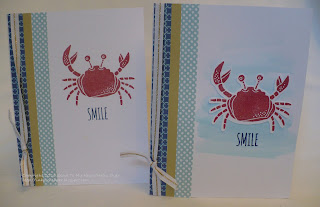
Layouts aren't the only thing you can make with the Regatta Workshop Your Way kit! It includes instructions for 8 cards (requiring additional card bases), and I added a 9th with my scraps. I used the cute new Beach Days stamp set with the Regatta kit. For most of the pairs, I created one according to the guide but added watercolor paint to the other.
The Beach Days stamp set coordinates with cuts on the CTMH/Cricut Artistry cartridge.
Here's my bonus card. I had to use that cute octopus!
Thanks for stopping by and hanging with me through the end! Be sure to leave a comment and then continue on to TAMMY'S BLOG to continue the hop to see more great ideas.
 |
| Click HERE for all the hop participants and their blogs. |


Lots of work. Looks great.
ReplyDeleteI love what you did with the Regatta WYW. Fantastic layouts and cards!
ReplyDeleteYour photos go perfectly with those layouts, and I absolutely love your cards!
ReplyDeleteGreat paper choice for your fun filled cruise photos. I haven't yet used the PML cards in scrapbooking yet as I really like Studio J but I guess I'll be trying it soon when Studio J goes away. Thanks for being part of the Seasonal Expressions 1 Blog Hop and inspiring me today!
ReplyDelete:) Marie
Great use of the WYW, it turned out well.
ReplyDeleteGreat layouts and cards. They look even better "in person."
ReplyDelete