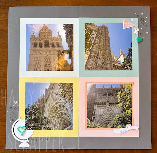
And now for the right page:
If I were making this again, I would make some of the circles on the left page, moved over onto the right and sum of the squares on the right, moved over to the left to have a little bit better balance.
The front page is actually cut in half and placed into two 6 x 12 flip-flaps which open to reveal more photos and the actual base right page layout.
And the final 4 x 4 flip-flaps and photos!
So how many photos are on this two-page spread? Guess in the comments!


No comments:
Post a Comment
Thanks for taking the time to visit and leaving me a comment!