It is time to say goodbye to some of our favorite Close To My Heart products that are retiring at the end of the month (available while supplies last). We hope that you will enjoy this hop! (If you're already hopping then you've probably arrived from Cat's blog. From here, you'll visit Brenda next.)
When I first saw the Memo Fundamentals paper pack, I knew that I had to have it! The map paper was going to be perfect for scrapbooking some of our Europe trip, and as a teacher I of course love the other patterns in this pack too. Well, it's been a year since our trip, and I am finally making time to scrapbook our memories. I had to use the map page in its entirety as our album title page.
Once I created my banners (using some of my favorite retired alphabet sets), I laid them out on the photo mat and layout where I wanted them to go. I used a strip of washi tape to hold them together. I could then pull the entire collection off of the mat and stick it down under the mat.
The mat completely hid the washi tape and everything was where I wanted it.
The School 7-12 Complements, black and white dots, and black shimmer trim were fun ways to add some artwork and sparkle to my layout.
If you look closely, you can see the airplane that I cut out with my CTMH/Cricut Artbooking cartridge. I doodled in the flight path and tried to mark on the map our major stops.
Thanks for hopping by! I'd love a comment before you go to Brenda's blog next! Don't forget that everything featured in this hop is only available through the end of the month.
Stamping, scrapping, and paper crafting: create, craft, and connect at my classes and online!
Sunday, July 16, 2017
Saturday, July 15, 2017
Prickly Pear Blog Hop
Each month, Close To My Heart features a paper pack, and July's focus is Prickly Pear. (If you're already hopping then you've probably arrived from Gerri's blog. From here, you'll visit Erica next.) I wanted to share some different ideas with this collection! I have two projects that fit the theme and one that you probably wouldn't think would be made with the Prickly Pear Workshop Your Way collection. (I always get the Workshop Your Way because you get great coordinated products at a great price.)
First up are my projects that you would probably expect from Prickly Pear.
We had a taco bar family fiesta for our daughter's 16th birthday, so this collection was perfect to highlight our photos of her special day. I used Sea Glass card stock for my base pages. (We will be making this layout at my class on Sunday.)
In addition to using the Complements and the embellishments from the Prickly Pear Workshop Your Way, I stamped the title with the July stamp of the month, Storybook Alphabet. After stamping the title with black Momento ink, I used my small waterbrush to color in the designs with Poppy, Lemon, Emerald, and Sapphire ink.
You can see how I used a large Picture My Life journaling box for my journaling and a small one as a mat for my smaller photo.
Since the CTMH/Cricut Flower Market has cacti cut outs, I knew that I had to try them out for our fiesta. (These are all made with one key on that cartridge.)
This intricate cacti can all be cut with one push of the Cricut button. (I set it at 6", the largest it would actually cut.) I used Willow card stock (not part of Prickly Pear) because I thought that it was a pretty authentic color. I cut a square base to adhere this one to so that it would stand up easily.
This little guy started with three identical bases cut from Emerald card stock (set at 3") and then the corresponding overly cut from the Sea Glass strip in the Prickly Pear collection.
I folded each cactus in half and then glued the three of them together so that it would stand up.
This one measures 9" tall. It did NOT want to stand up so I folded up the bottom pieces a bit and glued them to a square base.
My final project isn't your typical Prickly Pear layout. I did use the Emerald, Sea Glass, and Sapphire color combo found in this collection.
The pretty Sapphire border is a pair of zip strips (the decorative piece that you cut off of the 12"x12" paper.) I used aqua shimmer trim and pieces of the Prickly Pear Complements to embellish my layout.
The bike sticker is actually from the School 7-12 Complements that I added after I had taken a picture of the two pages together. I used a retired alphabet stamp (The Works) for my title info.
I hope that I've been able to give you lots of ideas with this fun paper pack! You don't have to have live in the Southwest or throw a fiesta to enjoy this paper pack. I'd love to know what you think of my projects before you go on to Erica's blog. Thanks for hopping!
Wednesday, July 12, 2017
Europe 2016: Garden Layout
Since I have been working hard to scrapbook our European photos, some of my layouts have been a little less creative than others. I had a really good time making this one with four pictures from a garden near my cousin's apartment.
The Live Beautifully paper pack was the perfect collection to use with these pictures! (It is still available while supplies last HERE.)
Because my typed journaling covered up a lot of the pretty Sea Glass floral paper on the far left, I decided to copy the sketch idea (below) and cut the lines of text into strips and then adhere them. I really like how that turned out!
Rather than use the coordinating stamp set, I cut a gorgeous gold foil flower out of one of the sheets of card stock.
I used a mix of gold and retired aqua sequins to embellish this layout.
My layout is based on this pretty sketch:
Thanks again for letting me share our epic adventure with you!
Monday, July 10, 2017
Stampaganza Blast from the Past Blog Hop
One of my faves in in the group is the lovely Paper Bird set that I am featuring in this hop. I actually used it recently to make a set of thank you cards. All of my cards used the recently retired Dreamin' Big paper pack. As you can see, this set includes a lovely butterfly in addition to the bird and heart.
![]() |
Thanks for stopping in. Please leave a comment before you go. Now it's time to get more ideas at the next stop on the hop at Michelle Loncar's blog.
![]() |
| {Click HERE for all the hop participants and their blogs.} |
H2H Challenges: Oh, the Place You'll Go!
This week's Heart2Heart Challenge is really open to interpretation. It's certainly the season for travel, but this is also the title of a Dr. Seuss book that is often given at graduations because of its inspiring message. Of course I had to go with the travel idea!
When we were in Copenhagen last summer visiting my cousin, he took us so many places, but two of the highlights featured amazing sculptures by the Danish artist, Thorvaldsen.
We first visited the Cathedral of Our Lady of Copenhagen. It is really worth enlarging this picture to see his amazing statue of Jesus and the angel baptismal font. Because I had a lot to say, I typed up my journaling and printed it onto our White Daisy card stock (cut it down to 8.5"x11" and run it right through your printer). I had so many pictures that I decided to use a flip flap with the cathedral exterior on the front and the journaling underneath.
Because of the beautiful gold, grays, and whites in my photos, that was the exact palette I used: White Daisy, Whisper, Slate, Goldrush, and of course gold. I used a mix of current and retired gold embellishments to accent my layout. If you haven't tried the All About Gold Fundamentals, you need to get a pack before they're gone! (They are the diagonal striped pieces on both pages. It's hard to tell on the right page, but I used it as an overlay on the Whisper piece on the top left.) The gold foil and gold sequins are also still available if you're interested.
Be sure to check out all of the inspiration from the H2H Design Team and join us before the month ends! Bon voyage!
Wednesday, July 5, 2017
Europe 2016 Layout 1: Introduction & Overview
Last summer, we took our girls on an epic European adventure. I have been ordering pictures when there are sales (and still have a ton to order) and am committed to getting this trip into an album this summer. (Summer is already halfway over for this teacher, too...) I will be randomly posting my layouts so thanks for reliving the trip with us!
This layout is all about the story: planning the trip and the first day/flight escapade. I also wanted to have our itinerary here as a guide. Don't be afraid to create a layout with few if any photos.
After I typed up my journaling, I printed it on our White Daisy card stock. Both pages of the layout use Cranberry as the base for a huge pop of color. It boldly accents the Memo Fundamentals map paper and coordinates with my Air Canada tickets.
The embellishments are mostly current: red enamel and gold glitter gems, School 7-12 Complements and retired washi tape. I stamped my title with the Framework alphabet with Cranberry ink. Don't be afraid to mix and match products and use up your stash!
Monday, July 3, 2017
H2H Challenges: No Worries
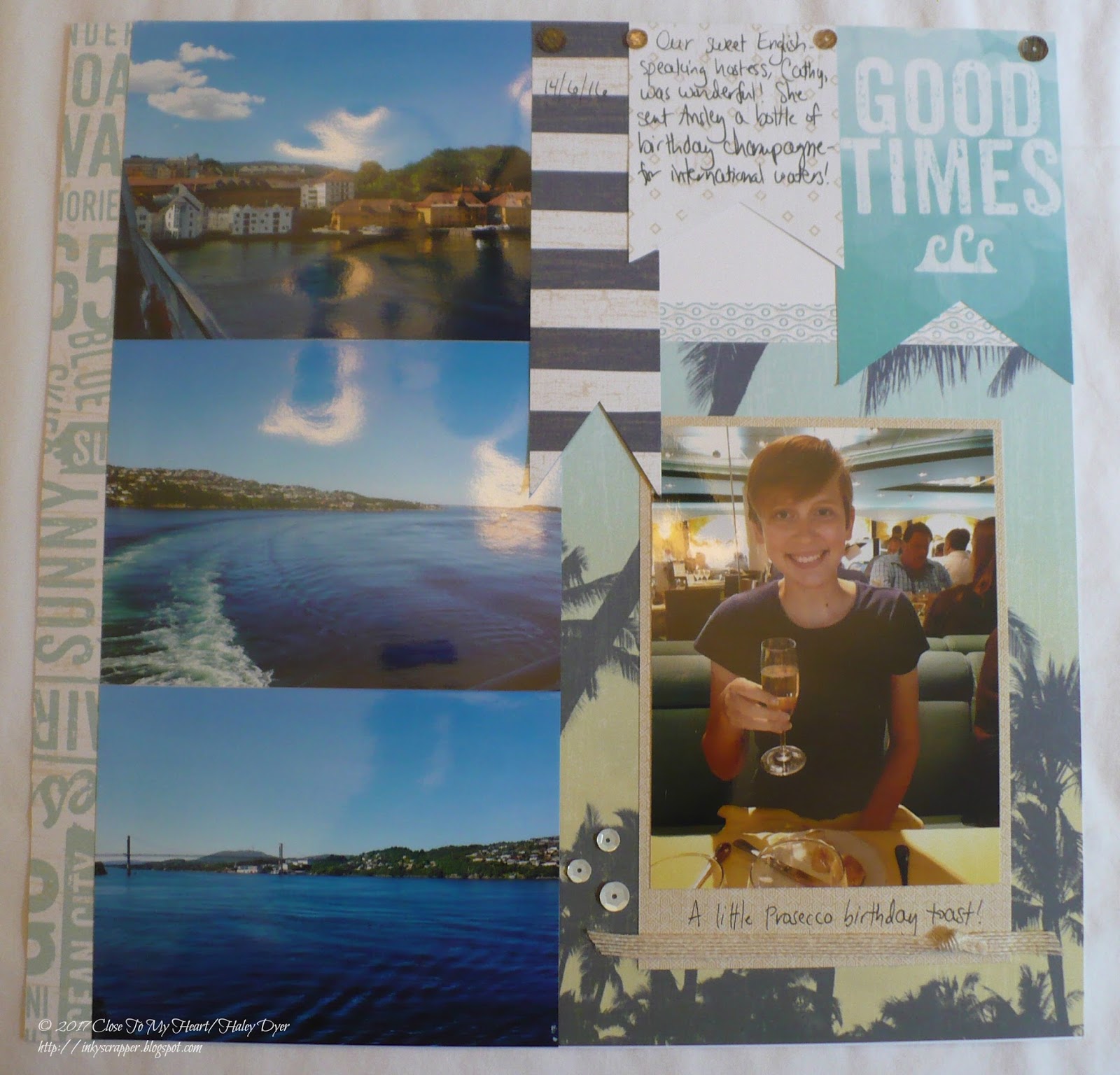
If you follow or have frequented my blog, then you know that the No Worries collection is my favorite from the current Seasonal Expressions! (I like the other collections, but I LOVE No Worries!) I have had absolutely no trouble creating with this paper pack! My current summer goal is to scrapbook our pictures from our amazing European adventure last year. No Worries came to the rescue, of course!
The great thing about the Workshop Your Way collections is that you get embellishments and artwork (stickers, etc.) to complement the paper pack. Everything I used came straight from the No Worries Workshop Your Way.
Both pages of my layout were based on sketches from Reflections. On the right page, I cut down the "Good Times" 4"x6" Picture My Life card to make a banner.
Thanks for checking out my No Worries project! If you don't have the paper pack, you can still participate by using the beautiful No Worries colors! Thanks for letting me share a little bit of our amazing, epic adventure with you! Be sure to join us at H2H!
Saturday, July 1, 2017
July Stamp of the Month Blog Hop: Storybook Alphabet
The Close To My Heart July stamp of the month is a fun font set called Storybook Alphabet. Follow this blog hop for lots of great ideas from 16 talented CTMH consultants. (If you're already hopping then you've probably arrived from Sheila Bennett's blog. From here, you'll go to my friend Alyson's blog next.)
We took an amazing trip to Europe last summer (and I am enjoying reliving it in my Facebook memories), so my goal this summer is to get it all scrapbooked. I thought that the Storybook Alphabet might pass as a Scandinavian font so I grabbed photos from our visit to Bergen, Norway and ended up pairing them with the Enchantment palette of Sapphire, Poppy, and Saffron.
But wait, there's more! I added a pocket page in between my traditional layout because I have sooo many photos!
Here's a close up of the Storybook Alphabet. For this project, I stamped my letters with Sapphire ink and then went back and colored in details with our ShinHan Twin Touch markers. (Did you know that there is a color chart to help you blend colors to match our colors? I'll be happy to share it with you if you don't have it already.)
Here is a close up of the left page. Do you know where my embellishments came from?
If you guessed the School 7-12 Complements you would be correct! I also used some No Worries sequins.
Here is the right page. On both of my journaling boxes, I started my paragraph with the first letter stamped, like an illuminated manuscript.
Thanks for letting me share my memories of this great day on this great trip! Please leave me a comment before you go. It's now time to go see how the amazingly talented Alyson will wow you with the Storybook Alphabet! (Just click on her name to go to her blog.)
![]() |
| {Click HERE for all the hop participants and their blogs.} |
Labels:
blog hop,
CTMH,
Picture My Life,
scrapbooking,
stamp of the month,
stamping,
travel
Subscribe to:
Posts (Atom)